
JOY FM recently completed a research project that took a deep dive into our city!
The result? A lot of people in St. Louis are looking for hope.
They want less stress, more peace, and more joy. They are also looking for a radio station that helps them feel hopeful and inspired, helps change their mood and is a safe place for everyone to feel seen and loved!
Surprisingly, the research confirmed that many of these same people are unaware that a radio station like JOY FM already exists. They’re looking for something and it is closer than they think!
Joy is findable. And, so is Jesus! But many in our city are unaware.
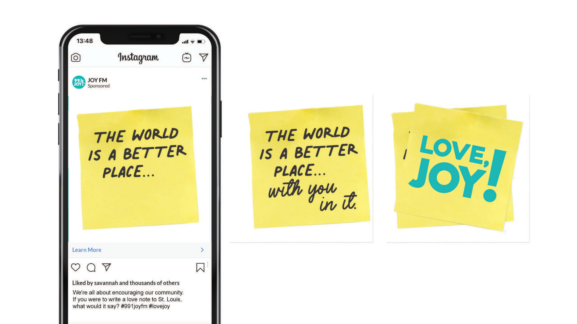
God has orchestrated an amazing opportunity … to make sure everyone in the St. Louis metro area knows where to find what they’re already looking for. More hope. More JOY! That is why JOY FM is launching a massive outreach campaign simply called: Findable JOY.
A national marketing firm is helping JOY FM craft messaging to reach the entire St. Louis metropolitan area. A few of these creative concepts are being researched now to see what messages would best resonate with our community!
Below is a sneak peek into some of the initial creative concepts!
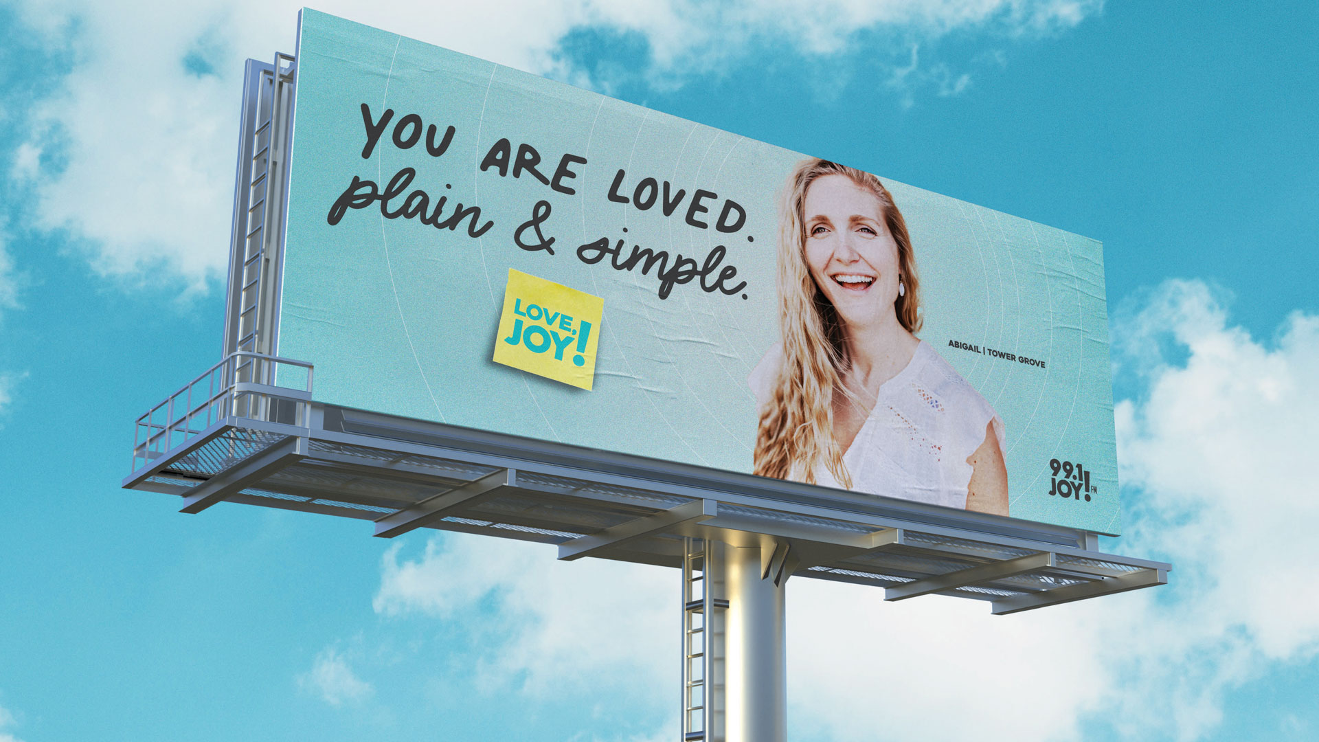
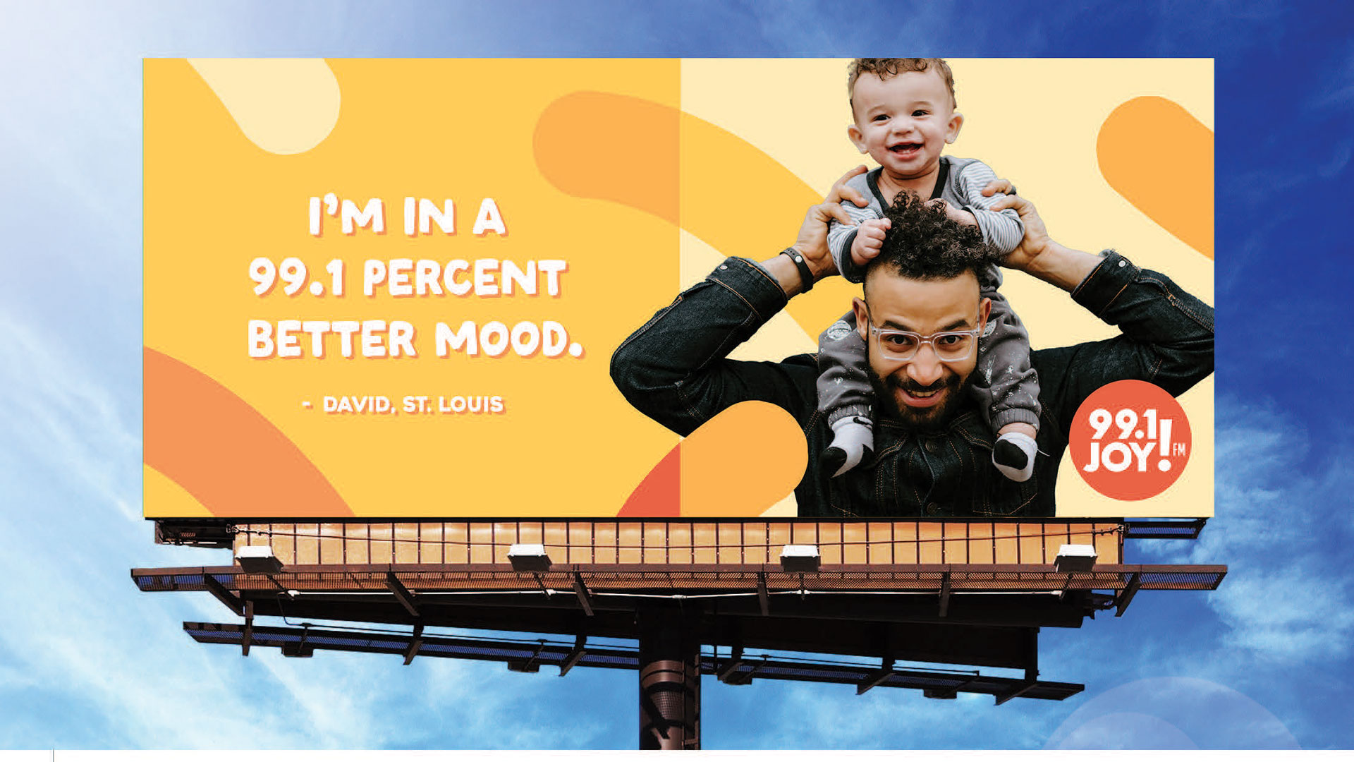
Concept Option #1
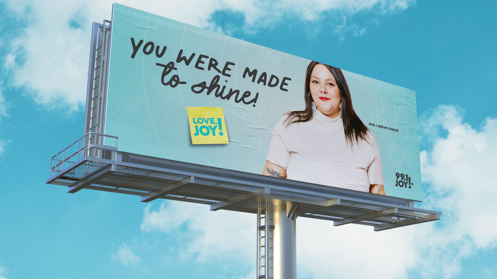
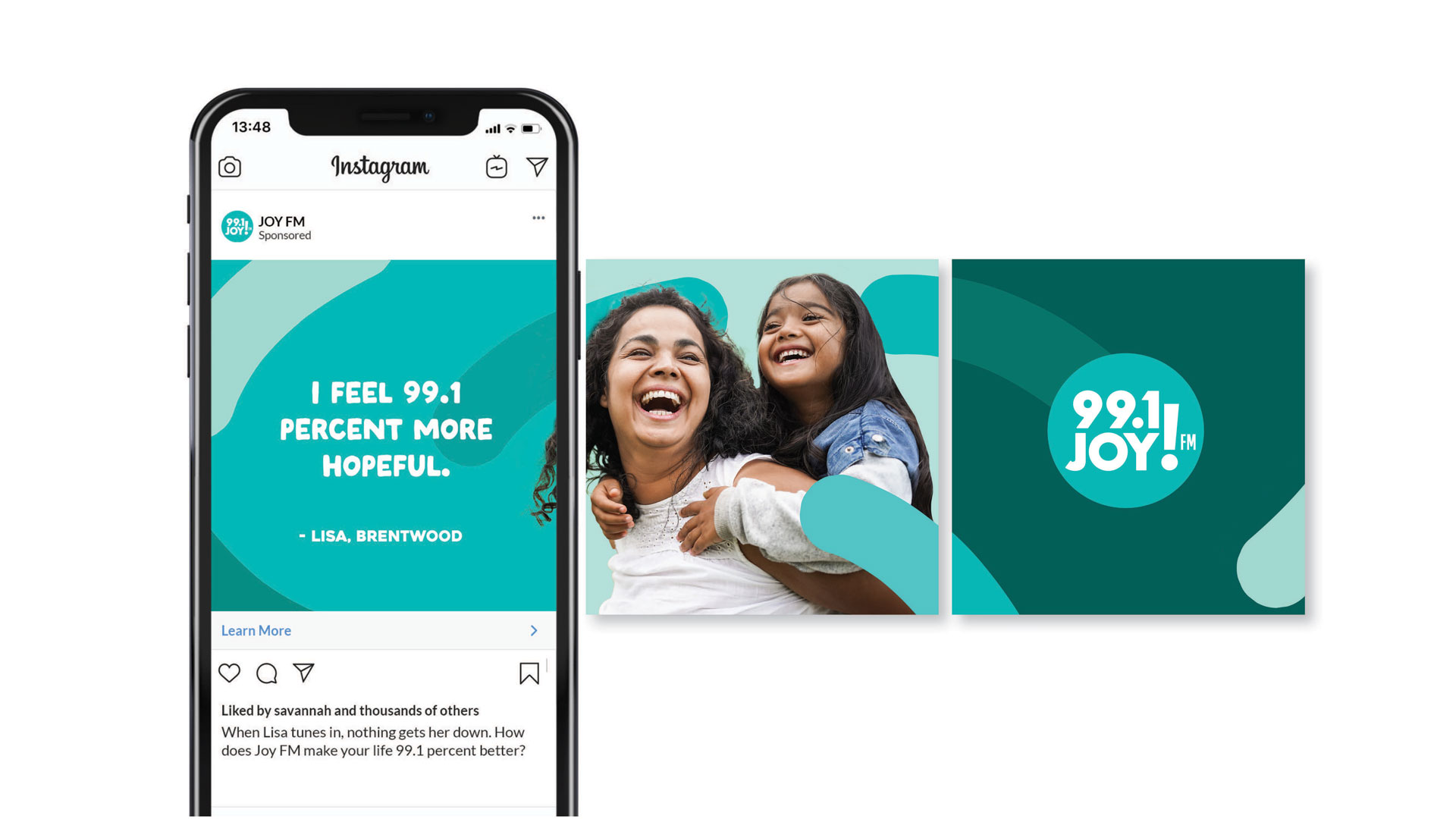
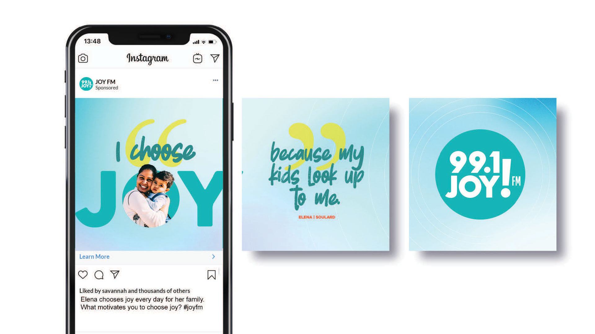
Concept Option #2
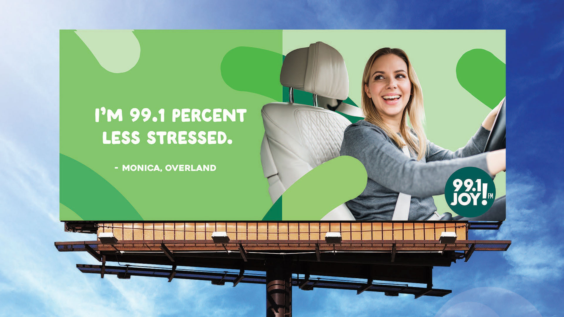
Concept Option #3
As feedback is shared and decisions are made, you will be able to stay updated on the project right here! Please come back and follow along!
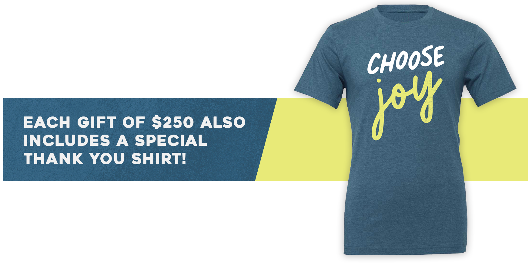
None of this would be possible without you! Your gift, right now, during Listener Support Month will not only power JOY FM for the year, but it will also fuel this outreach. Your investment will reach hundreds of thousands of people who are looking for more hope and joy.
THANK YOU for being on mission with 99.1 JOY FM!


I like option 2 the best because it’s real people and more relatable, easy to read at a glance. Bright and colorful catches your eye as you drive by.
I like concept #1.
I love them all but concept 2 is my favorite!
I like them in the order they are presented. Number one is my favorite, then, number two, and then number three. I like number one because those messages are what people need to hear. I also think it matches what you hear when you actually listen to the radio station. That you are loved. This is a basic human need.
Same
I agree with this comment.
I like option one, top one, however all three options are good and joyous.
I love option 2!
I like all three option but my favorite is #3! I CHOOSE JOY!
Option #1. WE ALL NEED TO KNOW WE ARE LOVED! Many struggle not feeling loved and this peaks an interest. I would also add another billboard – You have a purpose!!
Good one❣️
Option #2 because outreach to the unsaved is the goal, and #2 clearly shows the place to go on the radio to find info on the solution
I like Option #1 and #2. The billboards will encourage people to check out the station to see what’s this JOY thing is all about.
I like Option 1 best. It gives a direct and positive message to the person reading it.
I think the JOY FM logo in the corner could be a little bigger or a different color (like in options 2 & 3) to stand out and make it clear that it is a radio station.
Exactly! Needs to be distinctive enough to be noticed from the highway.
Yes, I agree with this comment! Love it!
Concept one catches the eye more and a lot more plain and simple. And the message is more personalized to the viewer. The aesthetic brings a warmth and invitation to listen.
Love option #1! Catches your attention, while still being “plain and simple.” Love the idea of using actual people and not photo stocks!
This is an awesome idea! I hope this gets the word out to everyone that needs to hear it.
I love #1 and #3. But the font on #3 is hard to read “because there’s nothing else like it”
Option 2 is favorite. All are good
I like option #2 the best by far. It seems the most straightforward & directing people to tune in to reduce stress & improve your mood 🌞
Option 2
Speaks directly to what people are searching for! Relating to it- I want that!
I like all 3 options. On option 1 & 2 the logo needs to be in the middle before the person & maybe larger (it looks like an afterthought). In option 3 the logo is too close to the edge of the billboard and the bottom word’s font is hard to read. On a billboard the info has to be brief, altogether, and easy to read in a quick glance. The 99.1 has to be obvious.
Agree. Logo needs to be larger. People need to know what the ad is for. Most billboards fail in who the advertiser actually is.
I like concept #1. Plain and simple and easy to read at a glance while driving.
I like them all but #2 is my favorite.
I like all three concepts. Each reaches a certain group of people. I like the whole idea! Go Joy 99…
Lynn dixon. I like number 2. The smiles and amazing reason joyfm is special. I love you guys. I listen often
#2 seems to be with real people.
All 3 are great but #2 has the added spice of cleverness which appeals to me.
I like option 1 best, but think the joy FM logo could be bigger. My hubby likes option 2 best. 😁
I like 2 or 3 the best……..not really a fan of 1.
#2 is simple and clever. Would make me want to check it out.
I like option 2 because it is hopeful by encouraging listeners by telling them the results of listening. Just l8ke the phrase the right song at the right moment.
I like #1 catchy quotes. Gets their attention. But put your radio logo in big letters cause you can’t see it and that’s the whole purpose of it: to spread the good news you exist to help us all! Thanks!! Absolutely LOVE your station! Go Joy FM!
MaryPat Knight
I like option 2 the best. I like it because it has 99.1, which is the signal station. I also like how you used people in the St. Louis area in the ads.
I like option 2 the best! It seems to be SO relatable and real, which I think is best for people who don’t know Joy or Jesus. I also really like that the JoyFM logo is so prominent. I think this option is the most likely to get new people to tune in.
I like Option 1 but it seems like the 99.1 Joy is too small and blends in too much to the background. The 99.1 seems bigger and more visible in the others. Has to be big and distinctive enough to be noticeable from the highway.
Option 2 is my favorite! Sends a great message, real life pictures and the clearest to try and get the message out to tune into 99.1!
My choice is #2, #3, #1
Concept #2
Number 2 is more eye catching.
I think concept #2 is the most relatable to people who are not followers. I believe that speaking to the transformation points will have the WIDEST reach bc people can get curious on what feeling less ”_____” & more Joy might feel like.
Sharing specifics on the actual “saving” that happens thru JoyFM on a daily basis: from overwhelm, stress, blah, sadness, loneliness, hopelessness, etc. thru music is amazing and “as easy as turning the radio dial”.
I also appreciate that it’s not claiming anyone is 100% better, but feeling 99.1% is pretty darn close 😇 love the play on words there.
Also I would love to continue to see more people of color and minorities on these advertisements. Reaching to ALL of our city and connecting us all as one ☝🏻
I was thinking the same thing about people of color and minorities, for the same reasons you said!
My class voted.
Option 1- 5 votes
Option 2- 11 votes
Options 3- 2 votes
We love listening to Joy FM in the classroom!
I love all of them. Joy fm is the best cure when you need a spiritual pick me up. Praise God for all the people that work there and all the wonderful work you are doing in our community 🥰👍
#2 is my favorite
All of them are great. I shared with my 17 yr old son. He relates to option 2. Says he can see himself listening and be in a better mood.
I like option 1
I like them all. #2 is my favorite. I think using pictures of St Louis’ diversity is more needed, like the Mom and Dad photos. Even though I am a white woman, I don’t think that is as relatable. I would love to see Joy billboards!!
Option 2 is my choice. I feel like Option 1 and 3 fade see to fade into the background quite a bit. 2 stands out!
I love the first option- it gets you as soon as you read it! I would like to see option one a little more diverse, the city needs support everywhere! Thank you doing this- awesome idea!!
Option 1 uses cursive and not everyone can read that anymore. I like option 2 because the survey said these were the points people were missing in their current radio station and the extra hint of 99.1 will stick on them subliminally. If people are looking for Hope, then one of the billboards should say something about hope.
I like option #1 the best Easy to read while driving and captures people’s eye Love the real people
I would however have the radio logo bigger and read 99.1 JOY FM missing FM
Thank you for the opportunity and love the mission
Blessing
Option 2 with diversity and real world feelings. Traffic and child raising frustrations.
Love Option 2!
Option 2, real people, easy to read at a glance. POPS!!
I prefer option 2. The people are very relatable, more to the candid side and the graphics are easy to read quickly. Additionally,I am drawn to the color schemes.